Ørsted Americas
Ørsted, a global leader in renewable energy and home of the world’s first offshore wind farm, is eager to expand its portfolio across the Americas. As the only brand designer for the entire Americas region, I worked alongside the Branding, Marketing and Sustainability team to enhance the company’s brand positioning and creative content to help differentiate the Danish renewable energy giant among American target audiences. I worked on a variety of graphic design and brand strategy projects, including but not limited to, seamless event branding materials, cohesive digital campaign graphics, thoughtful long-form print pieces, and branded marketing collateral.
Role
Brand Designer, In-House Creative Team
Year(s)
2022 - 2024
Notable Projects
Power of Green Hydrogen White Paper, Biodiversity Initiative Video, South Fork Wind Event Design
Brand & Marketing Design
The Ørsted brand is unique among the energy industry to reflect on its admirable journey in transitioning from black to green energy back in 2008. Many elements of the brand are inspired by the beauties of nature and embodies the characteristics of renewable resources such as wind, water, the sun, and the earth. The brand is heavily influenced by Danish Functionalism, which lends toward the overall tone feeling quite European. It was my responsibility as the Americas brand designer to keep the essence of the Global Ørsted brand while still prioritizing an American audience.
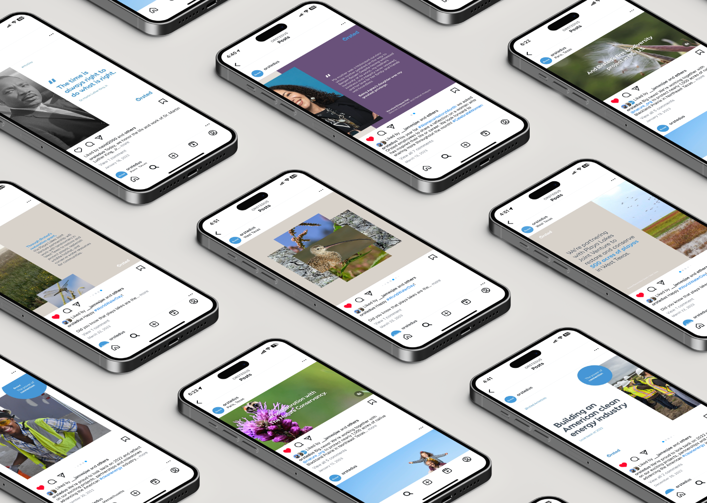
Marketing campaigns oftentimes included digital ads, social media graphics, factsheets for events, and billboards. Some common themes shown through marketing pieces highlight American job creation, conserving and protecting American landscapes through biodiversity initiatives, and providing clean energy for American households.
I had the pleasure of working with Ørsted biodiversity experts to create a promotional video for the region’s first ever biodiversity project in collaboration with The Nature Conservancy.
Ørsted Americas’ First White Paper
In addition to being a global leader in renewable energy development, Ørsted also focuses their efforts on educational pieces that help shape the general knowledge of the clean energy industry. White papers, a long form magazine-like document, is a common educational piece within the global business, usually focusing on highlighting key findings within the company’s portfolio.
I was tasked with building the region’s first white paper, The Power of American Green Hydrogen, outlining the powerful position that the US holds in the future of green hydrogen. I collaborated with Ørsted executives and green hydrogen specialists to create the layout design, custom infographics, and photography curation for the document, with the main goal of making complex findings digestible and informative.
Event Branding & Production
It takes years for a wind farm to reach completion, and once they do it can make national news headlines. Dedication or Inauguration events are a way for the press, local, state, and national level government representatives, and local community members to celebrate such an important milestone for both the company and the country. The events below highlight the dedication event for Sunflower Wind, a 200 MW wind farm in Marion County, Kansas, and the “First Power” event for South Fork Wind, America’s first commercial-scale offshore wind farm located just off the coast of Long Island, NY. South Fork Wind was part of a joint-venture effort between Ørsted and Eversource, which required it’s own unique brand guidelines separate from the Ørsted brand.
I had the opportunity to develop the branding and production of event materials for the Sunflower Wind dedication event, and worked with the joint-venture Ørsted and Eversource brand guide to create the branded materials for the First Power event for South Fork Wind. The First Power event materials were later used during the South Fork Wind Inauguration Event, which was also accompanied by a full website design.
Final Thoughts
Ørsted is a powerhouse player in the American clean energy transition with such an authentic, creative, and powerful brand image. Working for a European company that is eager to expand into the US market is a big challenge, especially when the visual brand itself is deeply inspired by Danish design. At the end of the day Ørsted Americas is an American company with American employees, projects, and initiatives, but it took some convincing to make the general American audience think similarly. I quickly realized that I had such a powerful role as a designer in this brand story; you can tell a lot about a brand by the way it looks, sounds, and feels. Small design details such as photography, messaging, colors, and intent are very important in crafting the right message for the right people.
When I first started working at Ørsted Americas back in 2022, the region’s brand image was still fairly young and trying to find its footing between staying true to its Danish roots and being authentically American. Today, Ørsted Americas has launched the country’s first utlity-scale offshore wind farm, taken charge on multiple natural preservation/restoration projects, and generated thousands of jobs, boosting the American economy, undoubtedly becoming an iconic, American company. I was a very small fish in the sea that is Ørsted, but I know that their story could not be as impactful if it wasn’t for branding and design.


